When it was time to design the cover for the second book of my Crazy Tricks Club series, I already knew a few things.
First, I was going to be using the same cover designer and style as my first book.
I really loved what my Indonesian cover designer, Lin, had done with the first book, and we’d already designed the lead three characters, so it was obvious to continue with him.
Second, I wanted a more action-oriented cover featuring a scene from the book. While I love the first book’s cover, it’s a bit static and metaphoric, so something more lively and straightforward was in order. Thus, I fired up my copy of Manga Maker Comipo and began playing with possible scenes. After a few tries, I came up with the following image.
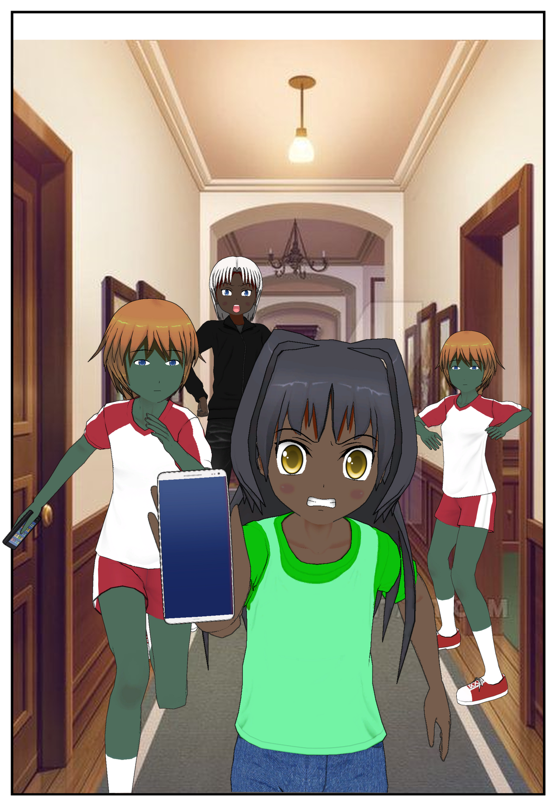
I used Comipo for the first cover as well, since it was an easy way to give my artist (whose first language wasn’t English) a good idea of what I wanted. I can’t draw worth beans, but I do understand basic layout and had an idea of what I wanted in mind. The main character of the book, Kate, running at the audience while being chased by a pirate and zombie volleyball players. (This takes place at a Halloween party, it’s not fantasy story.) Her phone would be up because I wanted to include the other two CTC members in the picture as well- Aiden and Brent.
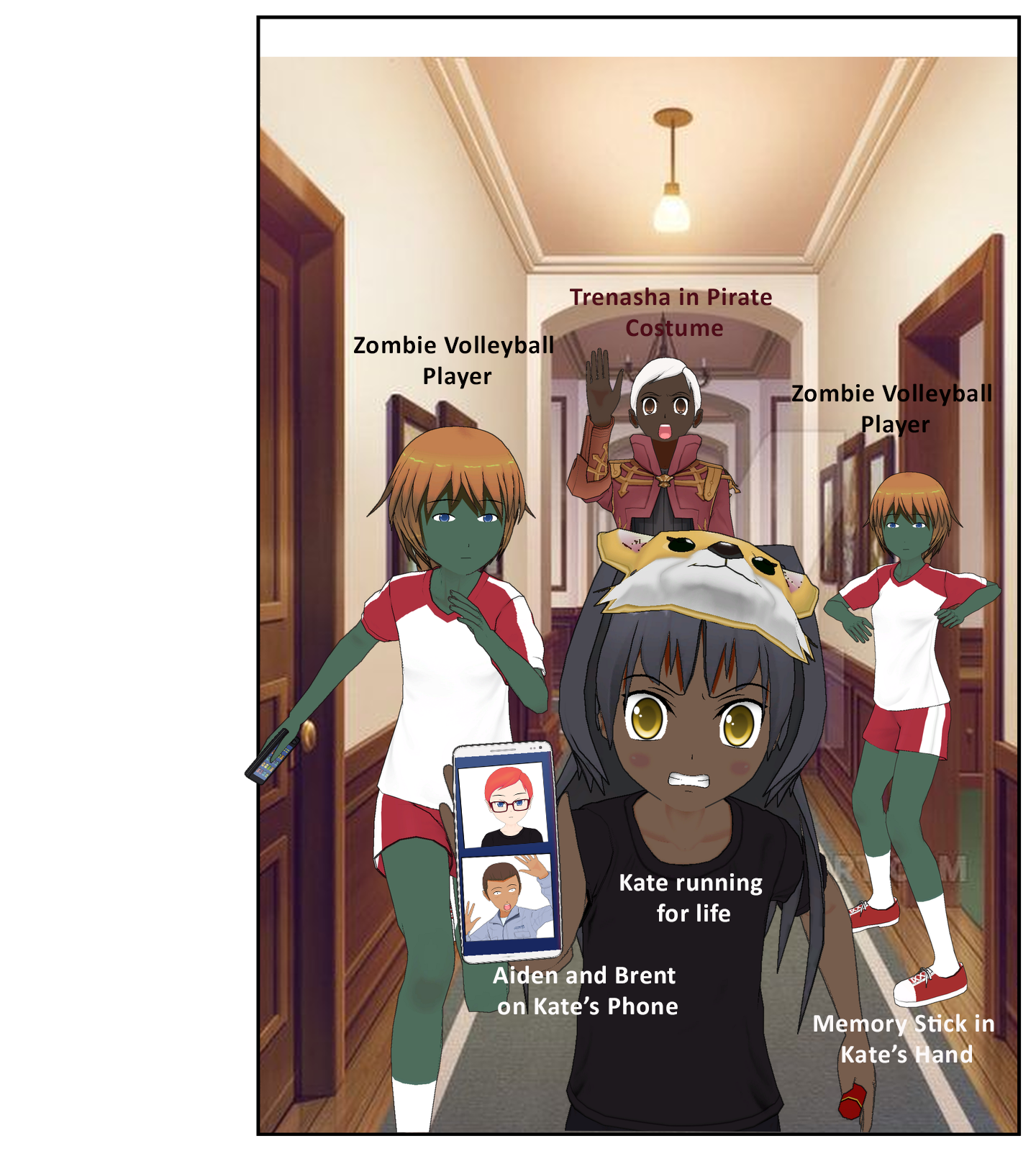
Once I had the rough image, I continued to play with it by adding some more details and notes. I also moved the pirate character to the middle so that she and the other two framed Kate in the picture for better symmetry. Kate is now wearing black like she does in the story, and has a mask on her head. Comipo doesn’t have a cat mask, which it should be, so I used a fox mask included in the software instead for representation.
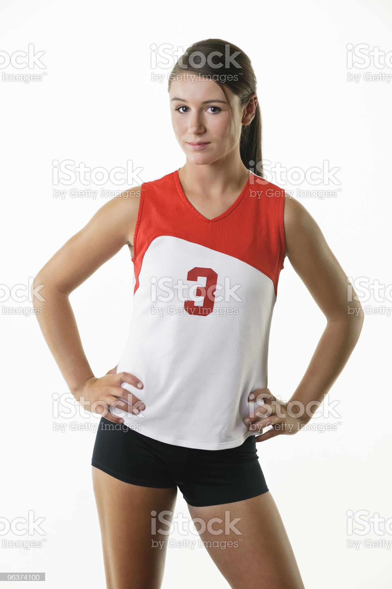
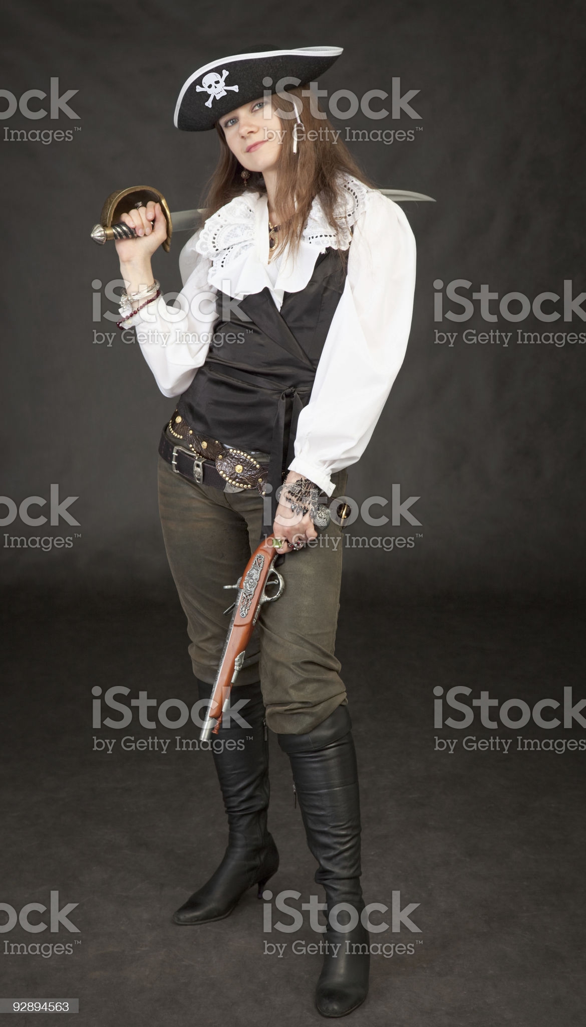
Also, I sent him some stock photo pictures to use for the other characters.

After this, I was ready to send it to my artist with notes, and the two of us began going back and forth on details. However, thanks to the above design, it was much quicker than the first cover because he knew fairly well what I wanted.
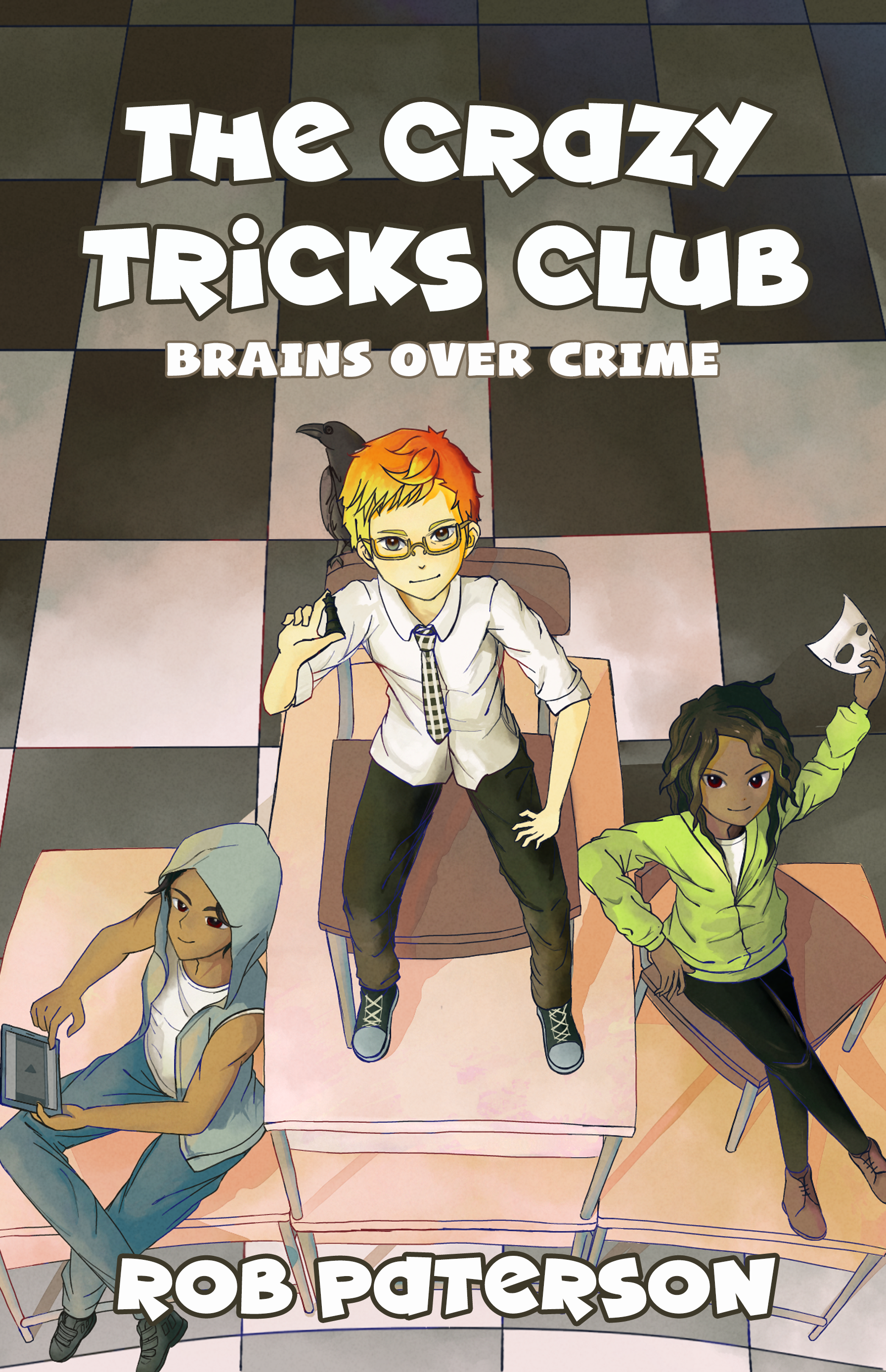
And this is the end result!
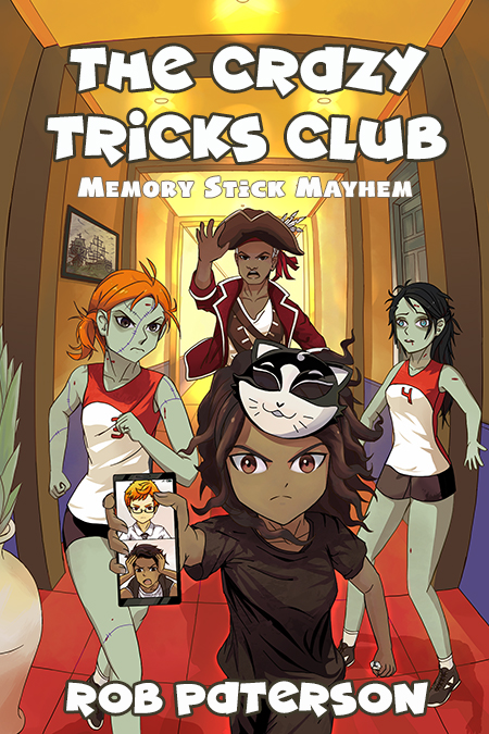
I’m pretty happy how it turned out. As you can see, we changed Kate’s expression in development to make her look more determined and less scared. We also played with the colors and designs, but overall it was a pretty smooth process.
The book itself is off to a strong start on Amazon! Let’s hope it continues that way!
Rob